| View previous topic :: View next topic |
| Author |
Message |
Eddie Eagle
M&M
Joined: 23 Apr 2008
Posts: 2393
|
 Posted: Sat Jun 11, 2016 11:53 am Post subject: Test Driving a new website Posted: Sat Jun 11, 2016 11:53 am Post subject: Test Driving a new website |
 |
|
Found an easy builder and nice look. Might put the voicezam player in too.
thoughts? The mobile and tablet version doesn't have the flash playing on the front page and I found I have to open new tabs for the content if I don't use the menu.
krop.com/eddieeagle |
|
| Back to top |
|
 |
Eddie Eagle
M&M
Joined: 23 Apr 2008
Posts: 2393
|
|
| Back to top |
|
|
Jason Huggins
The Gates of Troy
Joined: 12 Aug 2011
Posts: 1846
Location: In the souls of a million jeans
|
| Posted: Mon Jun 27, 2016 6:55 pm Post subject: |
|
|
I like the video background and full screen site. I do have some personal preference type of things and I'm not a designer so what I say may be worth exactly what you paid for it 
The name and title screen is too busy for me. I like the video, but the dark text on the kinda dark video made me stop and think when I first loaded the page. I was thinking...what do I do? I intuitively scrolled, but some people might just get stuck right there. The down arrow is invisible for a lot of the beginning of the video because it is the same color as the street with reflections on it.
The top menu bar is kinda hidden and when you click it it is a huge list with small text and is kind of overwhelming.
Also the text below the fold is fine, but it is a lot of text in a big list again and I just scrolled right past it because (I'm talking like a visitor) I don't have time to figure out what I want to read so I just don't read anything that doesn't just grab me.
I have a buddy Colorado who did a very similar thing with his site but I think his implementation is a bit better.
http://audioarchitects.com/
I'm still not 100% sold on his design, but I do still like the concept. I have no confusion when I first open the site as to what is going on. |
|
| Back to top |
|
|
Eddie Eagle
M&M
Joined: 23 Apr 2008
Posts: 2393
|
| Posted: Mon Jun 27, 2016 7:36 pm Post subject: |
|
|
Good info Jason. Thanks
I can make some changes. It's a template so I'll have to work with some of what I have. |
|
| Back to top |
|
|
DougVox
The Gates of Troy

Joined: 10 Jan 2007
Posts: 1705
Location: Miami
|
| Posted: Mon Jun 27, 2016 7:59 pm Post subject: |
|
|
...and I might be overthinking it, but silent video of a rainy NY street with muted, washed-out colors just doesn't seem like the best fit for the tagline "Coloring life with spoken words."
Also, there's a typo in Mike Thiesen's testimonial: "...to ultimately get what you what you want.
_________________
Doug Turkel (tur-KELL)
Voiceover UNnouncer®
UNnouncer.com |
|
| Back to top |
|
|
Eddie Eagle
M&M
Joined: 23 Apr 2008
Posts: 2393
|
| Posted: Tue Jun 28, 2016 6:19 am Post subject: |
|
|
Thanks Doug, changed the splash page video and the typo. Also made the font on the bio smaller.
|
|
| Back to top |
|
|
paulstefano
Backstage Pass

Joined: 22 Sep 2015
Posts: 411
Location: Baltimore, MD
|
| Posted: Tue Jun 28, 2016 7:10 am Post subject: |
|
|
Just looked. Totally agree with Doug. Why not have a demo playing under the video?
There's something very strange about a silent film being the first thing you see/hear on a website for a Voice actor.
_________________
http://www.paulstefano.com |
|
| Back to top |
|
|
paulstefano
Backstage Pass
Joined: 22 Sep 2015
Posts: 411
Location: Baltimore, MD
|
| Posted: Tue Jun 28, 2016 7:14 am Post subject: |
|
|
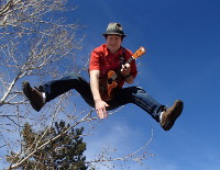
Also, I like the fly by. It goes well as a play on words for your name, Eddie Eagle. Have you ever thought of using a more birds eye view? There are numerous companies out there that do drone films. If you used one that had some dips, and dives, like the flight path of an eagle, I think that would be awesome.
Here's one company (full disclosure, my cousin is the owner) that does drone filming.
http://www.skysightfilms.com/
_________________
http://www.paulstefano.com |
|
| Back to top |
|
|
roger
King's Row

Joined: 30 May 2007
Posts: 1064
Location: Central Kentucky
|
|
| Back to top |
|
|
yarg28
Been Here Awhile
Joined: 25 Aug 2014
Posts: 267
Location: Indiana
|
| Posted: Tue Jun 28, 2016 8:03 am Post subject: |
|
|
one thing that I will never relinquish my opinion of, and will always be critical of, is when I have to click something or search to find a demo.
Style is great and can leave an impression but if i'm casting or producing and I get to a web site and have to make extra clicks or scroll to find/hear somebodies demo, then they are out. I color it as inconsiderate. I dont mean inconsiderate in a rude way but definitely in an oblivious kind of way where the person doesn't recognize how precious my time is. What else dont they realize? It's like presenting a resume with grammar issues. Sounds pretty haughty? I pay the bills...
Your demo should be front page...front and center...and easy to use. Everything else is just colored bubbles. It's all a distant second to the demo. I dont care about studio equipment, training, hobbies, etc. (not that you have those) I want to HEAR you and decide if I want to contact you. Which should also be painless and fast.
And sure, there may be some people that disagree but those people also wouldn't be offended if the demo was front and center. Dont help people filter you out. Your entire job, until you record, is to get people to filter you IN.
Looks great though 
gary |
|
| Back to top |
|
|
Eddie Eagle
M&M
Joined: 23 Apr 2008
Posts: 2393
|
| Posted: Tue Jun 28, 2016 8:33 am Post subject: |
|
|
I tend to refrain from any sound autoplaying on a front page. It's something I don't like on any website. (Personal Preference there for me)
I get the thought of playing a demo under the front page but rather let the viewer choose what they want. There seems to be a trend of this style of front page I put up so that's the thinking there. To be current "webwise".
As for point of view on the video I prefer smoother glide motion as opposed to a birdseye view. Easy on the eyes. I liked the idea of the street scene of NYC because it represented the hustle and bustle of life. The current flying view was my strong second since the graphics showed better and I also thought of Eagle flying
Paul, your cousin has some stunning camera quality. Today's drone cams are off the hook.
Gary
I get what your point is on "finding" a demo. My thought on that is a website somewhat reflects a personality also so it's more a total package of personality and casting people look for that as well as a talent's vocal delivery. There are other templates that are similar to my old site where I had demos on the front page to simply click but I chose this one because it's more the "now" type of website trending. I opted for Style this time around. The menu is a simple click of the site and Demos are at the top so that does make it easy to find.
Any other thoughts are welcome and thanks so far. |
|
| Back to top |
|
|
Lance Blair
M&M

Joined: 03 Jun 2007
Posts: 2279
Location: Atlanta
|
| Posted: Tue Jun 28, 2016 1:19 pm Post subject: |
|
|
I love the birds eye view. Clever.
I don't love having to go back to the menu every time to navigate. And 3 clicks to find your telephone number/email.
Should be able to immediately play the demos and then click your email while listening.
_________________
Skype: globalvoiceover
and now, http://lanceblairvo.com the blog is there now too! |
|
| Back to top |
|
|
todd ellis
A Zillion

Joined: 02 Jan 2007
Posts: 10493
Location: little egypt
|
| Posted: Tue Jun 28, 2016 1:58 pm Post subject: |
|
|
| Quote: | | it's more a total package of personality and casting people look for that as well as a talent's vocal delivery. |
i don't want to start a fight - but i believe that is completely untrue the vast majority of the time.
personally, when i'm looking for a voice i want two things & two things only.
1. i want to hear you
2. i want to contact you if i like what i hear
everything else is extraneous, or worse.
_________________
"i know philip banks": todd ellis
who's/on/1st?
 |
|
| Back to top |
|
|
Eddie Eagle
M&M
Joined: 23 Apr 2008
Posts: 2393
|
| Posted: Tue Jun 28, 2016 2:00 pm Post subject: |
|
|
Hey Lance Thanks.
Although it does take some clicks you can listen to a demo and hit contact having the agents info pop up while listening. 
Thanks Todd, no offense taken at all. I'm listening to all sides here.
Still thinking about VoiceZam too. |
|
| Back to top |
|
|
Bish
3.5 kHz

Joined: 22 Nov 2009
Posts: 3738
Location: Lost in the cultural wasteland of Long Island
|
| Posted: Tue Jun 28, 2016 3:00 pm Post subject: |
|
|
I think I agree with Todd. In fact, I do.
You can do a lot on a single page to convey who you are, what you do, and how to get in touch. There's nothing wrong with having a strong statement and a visual "grab" (in fact I like your front page... the navigation, hamburger menu, etc., not so much).
This has been discussed over and over, but the general consensus always seems to boil down to:
1) No autoplay
2) Have everything "one-click"on the front page (demos & contact).
3) No one cares about your bio. (maybe a pithy paragraph buried somewhere)
4) Real client logos or some indication of experience... majority say yes.
4) Testimonials ... the jury is hung.
5) Headshot... the jury is hung.
If anyone asks me about web design, these are always the prime concerns. All can be achieved with style and panache. I think you are getting there with that... it's just the nuts'n'bolts that need sorting IMHO.
_________________
Bish a.k.a. Bish
Smoke me a kipper... I'll be back for breakfast.
I will not feed the trolls... I will not feed the trolls... I will not feed the trolls... I will not feed the trolls. |
|
| Back to top |
|
|
|

